Studio Building Block Properties
After you have placed the building blocks for your application in proper sequence on the Message Flow canvas, you must configure each building block individually by supplying values for the fields in each block’s Properties pane.
Studio automatically saves the information you have entered through the Properties pane along with the sequences you have specified for the building blocks on the Message Flow canvas. This information is stored in your application’s XML configuration file, which you can consult at any time by clicking the Configuration XML tab below the Message Flow canvas.
You can open the Properties pane for a building block in either of two ways:
-
Double-click the building block icon
+ -
Right-click the building-block icon, then click Properties on the context menu.
About the Properties Pane
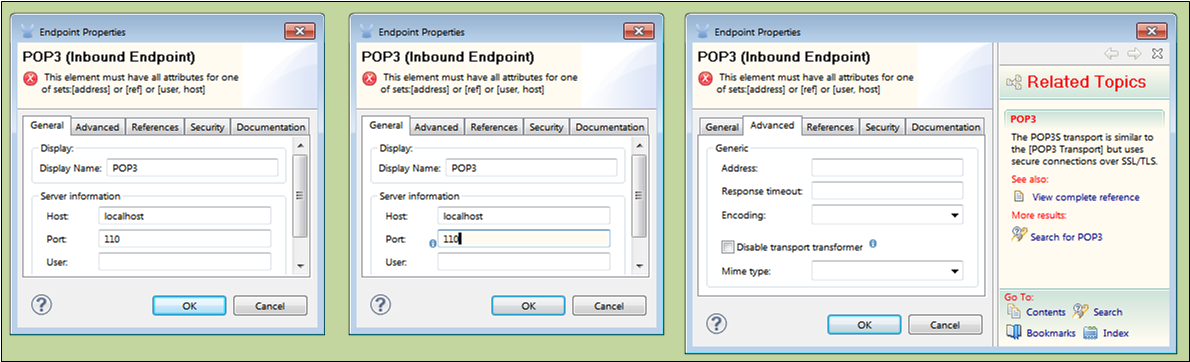
The Properties pane features three or more tabs and always opens to the default tab, which is General (See: below, left). Typically, the General tab displays all the fields you should or must configure for the associated building block. For example, you can accept the generic display name for a building block (such as POP3 for an inbound endpoint), but you also have the opportunity here to enter a more meaningful, application-specific display name such as "Catalog Requests via POP3". This descriptive name which may prove helpful both to developers and administrators later in the application life cycle. (The display name appears in the XML configuration code, under the building block icon on the Message Flow canvas, and in administrative reports to the Mule Management Console).
The labels in the upper left corner of the Properties pane indicate the specific building block name (in this case, POP3) as well as the Palette category (in this case Endpoint). For endpoints, Inbound or Outbound indicates whether the building block transfers data into or out of the flow.
The OK and Cancel buttons in the lower right corner of the Properties pane allow you to commit changes or dismiss them. The X in the upper right corner allows you to close the dialog without committing any of the changes you may have made.
When fields on the Properties pane are obscured, a vertical scroll bar appears. Alternatively, you can resize the pane by placing your cursor over a vertical or horizontal edge of the Properties pane, holding down your left mouse button, then dragging.
Clicking on a field highlights it (in this case, Port) and moves the text-entry cursor inside the field (See: below, center). In some cases a small i blue icon appears in the lower right corner of the field. When you hover you mouse over this icon, a yellow Help balloon pops up containing information relevant to the field.
Clicking the "?" icon in the lower left corner of the properties pane causes a dedicated Help pane to appear to the right of the Properties pane, (See: below, right). The Help Pane also provides the following navigational links:
Complete Reference |
Contents |
Search |
Related Topics |
Bookmarks |
Index |
Clicking the "?" icon a second time collapses the Help page. Clicking the "X" icon in the upper right corner of the Help pane accomplishes the same result.
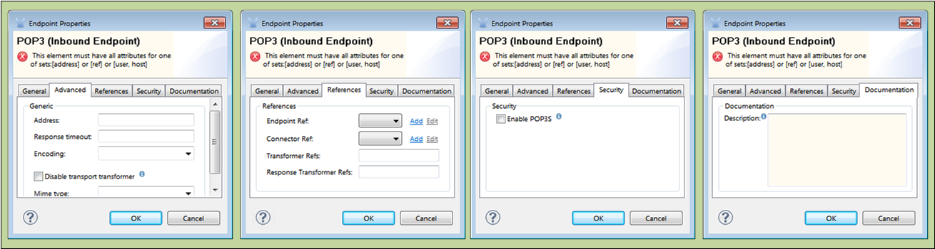
Other Properties Tabs
At minimum, the Properties dialog for each building block includes the General (See: above, left) and Documentation (See: below, right) tabs. Certain building blocks include some or all of the following tabs:
Advanced (See: below. right) typically displays the optional fields you set to fine-tune your building block. For example, setting a Response timeout value on a synchronous endpoint prevents the flow from hanging if the reply does not arrive within a reasonable time.
The fields listed on the Reference tab (See: below, left center) allow you to link your building block to a template for those building blocks, such as Endpoints, Connectors, Transports. You can also select or create a Global Element to serve as a template for the particular building block instance you are configuring. This global element provides a basic set of properties that you can reuse when configuring other, similar building blocks for other flows. Your local building block inherits the global element properties, which you can modify or augment, as necessary to meet the specific needs of the application you are developing.
The Security tab, which appears on the Properties pane for certain endpoints (See: below, right center), allows you to set security options for the messaging channels facilitated by those endpoints.
Documentation (See: below, right) facilitates entry of notes and comments specific to a building block. Studio stores this information in the application’s XML configuration file. Subsequently, hovering your mouse over the building block icon displays the information in a yellow Help balloon.